I was excited to see a recent release on the HealthStats NSW website that I was involved in, providing insights into illicit drug deaths in NSW. This project was almost complete when I left the HealthStats NSW team, and people from various teams were involved over many years, so it is great to now see this publicly released.
Why is this important?
This data is used for public health policy and planning, and the figures provide a wealth of information to better understand drug deaths, but providing the figures alone could lead to problems in their interpretation.
Here’s where the value of statistical communication comes in. I was involved in writing the summary piece that explains how these numbers come about, and how they can be used.
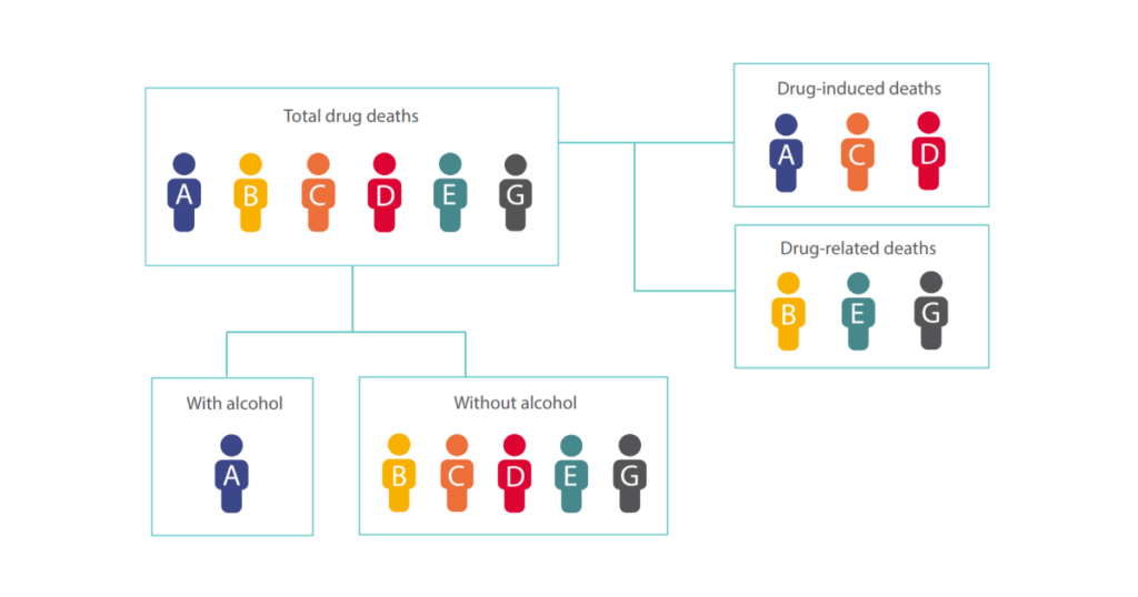
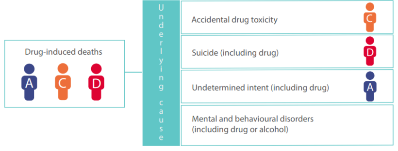
Drug deaths can be categorised as drug-induced (for example an overdose) or drug-related (for example drowning while under the influence) and identify if one or many drugs were taken at the same time, as well as if alcohol was involved.
As such, a death can be counted in multiple ways, and it’s easy for these figures to be inflated by over-counting if misinterpreted.
The challenge was to clearly communicate the various ways that drug deaths are counted in NSW, and we developed these flowcharts to highlight this in a simplified fashion:


Sometimes when people think of what statisticians do, they just think of numbers and analyses, but there is a huge importance in how and what results are communicated. And that’s where I come in!
